Global warming
I've been in interested in the global warming debate for years. I don't believe that man CAN change the climate, let alone believe that we ARE changing it. In November, 2009 all hell broke loose when a zip file was found on a Russian ftp server. This file contained many emails from the Climate Research Unit (CRU) at the University of East Anglia. and also program code and other data. It called into question a lot of the claims they have been making over the years. soon, other claims came into question, too.
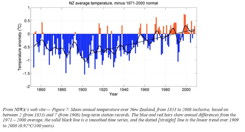
I ran across this article about temperatures in New Zealand. It includes a chart from New Zealand's National Institute of Water & Atmospheric Research (NIWA). Their chart looks like this
Wow, that looks pretty definitive, doesn't it? It's pretty clear that it's started getting hotter in, especially in the last few years.
The people that wrote the article got their own records from the same place as the chart above was made from and they came up with this chart
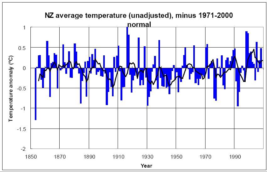
Hmmmm, something isn't right here. The authors mentioned that anyone can register at the NIWA web site and download whatever they want. So I did.
I had a little trouble with the interface and was only able to get the data from 1961 - 2008. The first chart above is annual mean temperatures even though it is labeled average temperatures. This is what I got - annual mean temperatures. The second chart may be mean temperatures as well, because I saw no data for annual average temperatures on the NIWA web site. Mean temperatures are not an average, they are exactly half way between the highest and the lowest temperatures in a year. I also don't know what they mean by "minus 1971-2000 normal" in the charts above.
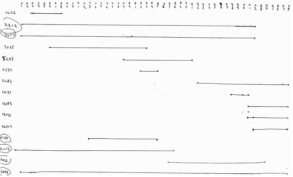
I chose regions randomly. I have no ideas where any region in NZ is, I've never seen a map that shows regions on it. Then in each region I chose 5 reporting stations at random. All I saw was the identifying numbers of each station. Since I don't know programming to reduce all of this down like they did in the charts, I just bought some chart paper and drew the annual mean temperatures for each station on a chart.
The first thing I noticed was that virtually all stations had incomplete data. One station only reported the annual mean temperature in 5 of 27 consecutive years!. Very few covered the entire time period, many only reported for a few years. I wonder how the "scientists" rectified this spotty data in their chart shown above.
Here's a chart I made of some stations and when they reported temperatures. I assume that the warmer temperatures were from northern New Zealand and the cooler temperatures were from southern New Zealand. The stations that are circled are used in the second chart.
After I did a few stations, I saw that it was going to be unproductive to do them all. I then only plotted stations that had long term data. I plotted them all on the same chart. I was only interested in the trend of temperatures. Here's my chart. Little cross hatch marks across the lines are years that each station reported no annual mean temperatures.
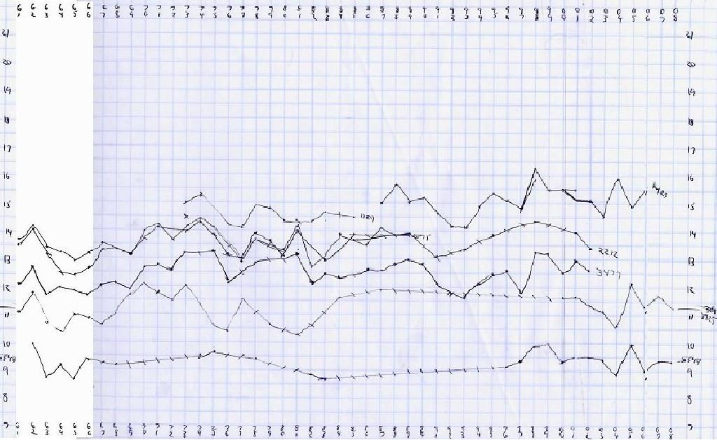
As you can see, there IS no upward slope of temperatures. There was no way for me to adjust or interpret the temperatures, I merely plotted them as reported. It seems pretty clear that my little experiment shows that the NWIW DID lie in their chart. They showed warming where there is none, just like the CRU did.
This article discusses NWIW's "Adjusting" the temperature data, starting on page 32
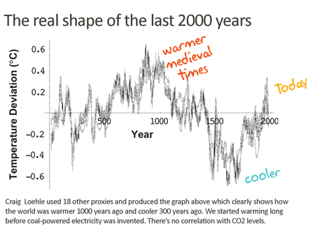
Here's a good article about the "hockey stick" scam
In December 2009 Al Gore claimed that there is a 75% chance that all polar ice will disappear in the summer within 5 to 7 years. I decided to check into it. I made a video showing what I discovered.